Figma Schema 2022: The 5 C's of a successful design system
2 minute read
Senior UX Designer Steve O'Connor shares some key takeaways from Figma's Schema Conference 2022, and how some of the ideas could influence our own developing approach to design systems.
Figma Schema is an annual, multi-location design systems conference that started in 2021. As well as hosting events in New York and Tokyo, Figma ran a Schema event in London which I was lucky enough to attend back in November. The organisers chose a fantastic venue -the Alva Coachworks, which was nice and easy to reach from our Cambridge offices - always a bonus!
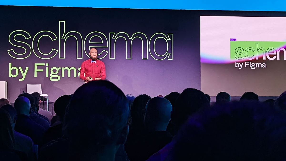
As well as keynote from Figma’s own master of the bowtie Jacob Miller, there were six other talks from people at various stages of their design system journey. We saw a wide variety of requirements covered, and lots of interesting and useful insights.

A particular highlight for me was hearing the story of the Design Tokens Community Group (DTCG). They are behind the open-source design token file format soon to be included in Figma. If you’re thinking “WTH are design tokens?” you can find a good overview here on the Adobe design system.
Louis Chenais (Specify) and James Nash (J P Morgan) took us through the file format creation, what it delivers, future developments, and how we can be part of the community. The talk featured some useful ideas which relate nicely to things we are looking to do with design systems at Nexer. We’ve been reviewing how we translate information between design tools (Figma mainly) and front-end tools which takes work and customisation. Having a standard file format that works for both saves so much time and work! The format also carries more information than we currently do, expanding what's possible to do.
Overall, I came away seeing a pattern in the talks about what it took to make each design system successful. Here are five points that stood out in particular:
Creativity
“Design systems kill creativity!” Is a cry heard often. They can be seen as rigid and unmoving, forcing designers to follow tight rules - but only if implemented poorly.
Jacob Miller says design systems should be used to “… reduce friction present in design to increase the creativity of designers.” Less time spent on documentation and creating the same elements over and over, and more time for adding touches of creativity.
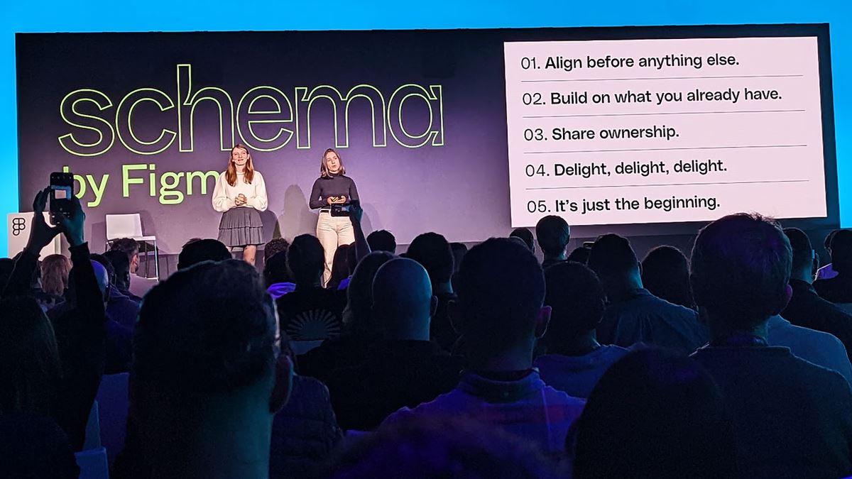
Gabrielle Houeix and Marion Echevard from Qonto gave a fitting example where their design team were freed up and took the opportunity to switch from using boring stock photos to using custom illustrations. In their words “always bring delight”.

Communication
A word that we should all get tattooed! Communication is key to any project going well, but it is especially true of projects requiring input from a variety of sources and teams - like a design system.
Developers, designers, researchers, content and service designers, everyone has something to contribute to a well-rounded design system. But it can only be done through useful, open communication.
Brice Fontaine and Jack Roles from Farfetch, an online fashion retailer, spoke about how siloed, uncommunicative working had led to two overlapping work and contribution processes for mobile and web versions of the product. By opening up the teams and lowering communication barriers they merged everything into one streamlined design system process, saving a lot of work and solving existing and future problems.
Meanwhile Antoine Puig & Ahcène Amrouz from France’s Service d’Information du Gouvernement (Government Information Service) had the herculean task of creating a design system that was both centralised and distributed to cater for a diverse ecosystem of brands. Communication was vital to getting the task done, and for building trust with the many stakeholders. They have now nurtured a large community with multiple channels.
Co-operation
Every single story told at Schema had a thread of co-operation. From the twin teams at Qonto developing a single design system, and the DTCG community creating a new file format, to the many, many stakeholders in France working together on a complex design system, co-operation was vital.
Leonie Proske and Gonzalo Vasquez from Zalando the fashion retailer talked about how a new EU regulation affected their website. It was vital to co-operate with feature teams who had deeper focussed business knowledge, and for them to have shared ownership.
Meanwhile at Brainly, a social learning platform, Patrycja Rozmus (Design Systems & Foundations Lead) got her team co-operating with their marketing department and 30,000 users to create their fantastic Pencil design system.
No design system can be built and maintained successfully by one part of your business. Only by everyone co-operating can it work.
Capture
How do you know a design system is working?
An aspect often not considered is how we measure success. The only way to know if a design system is effecting change is to know what was happening beforehand and at each stage. So, just as with any project, record a baseline! And take new baselines at key stages.
Gabrielle and Marion from Qonto’s story was full of metrics to show how their work had improved both processes and the product. Brice and Jack could show how each stage of their journey had made a marked difference by pointing to key results.
Continuous
Last but by no means least. Much like a website or any other digital product, the work is never truly finished. Design systems only work if they are kept under continual development. So, look after your design system and it will look after you!
Thank you to the team at Figma for organising such a positive and inspiring event. The topics covered offer great food for thought as we move forward in progressing our approach to design systems. For more of the fantastic Figma Schema talks, you can find the playlists on the Figma YouTube channel.

