Testing Accessibility on a Mobile Device – Part 2: Screen reader testing
6 minute read
It is our responsibility to ensure that everything we design and make is accessible to everyone, regardless of their visual, auditory, cognitive or physical abilities. This is no less the case when designing for mobile, but mobile accessibility testing has a few quirks of its own.
As we covered in the last blog, automated testing is a great first approach and can save you time, but it can miss out a lot of accessibility issues. You will need to test for these issues with a screen reader and by manually reading through pages and the code behind them.
Many users with little or no vision use a screen reader to access information on a site or app. Screen reader testing on a mobile device can be tricky at first, don’t worry: it gets easier with practice!
How to use a screen reader
When using a screen reader, listen to the page as if you can’t see what is on the screen. Ask yourself:
Can you tell what the function of each link/button is?
- If the screen reader reads, "button", then the user will not know what the button does. The code may read something a little like this:
<button type="button" onclick="alert('You have successfully added a new driver')"></button> - If the screen reader reads, "Add new driver, button", then the user will know what the button does. The code may look like this:
<button type="button" onclick="alert('You have successfully added a new driver')">Add new driver</button>
Are headings coded as headings?
- If the screen reader reads, "About us", then the user cannot skip to this heading. The code may read:
<p><b>About us</b></p> - If the screen reader reads, "About us, heading level 1", then the user can skip to this heading. The code may read:
<h1>About us</h1>
Does the screen reader read out the form labels?
- If the screen reader reads, then the user does not understand what the field is for. The code may look like this:
<label for="email_address">Email:</label>
<input type="text" name="email" id="email"> - If the screen reader reads, then the user does not understand what the field is for. The code may look like this:
<label for="emailaddress">Email:</label>
<input type="text" name="emailaddress" id="emailaddress">
Does the screen reader read out required form fields?
(The next four points make use of the Accessible Rich Internet Applications Suite (ARIA) – you can read more about this in the>WAI-ARIA Overview).
There are three ways to make sure a screen reader declares which fields are required:
- Use the word “required” (or “optional”) in the interface:
Name: (required) -------------- - Use an asterisk (and a key):
Name*: ----------------------- - Use ARIA. For example:
<div class="text">
    <label id="tp3-label" for="email">E-mail:</label>
    <input type="text" id="email" name="email"
        aria-labelledby="tp3-label"
        aria-describedby="tp3"
        aria-required="true" /> *
</div>
Does the screen reader read out an alert if there are errors when a form is filled in?
Errors that are shown on a page, for example when the user submits a form, are not automatically picked up by screen readers. This leaves screen reader users waiting to find out why the form has not submitted.
To make sure these errors are picked up by the screen reader, code your errors using the ARIA “alert” role:<h2 role="alert">Your form could not be submitted because of 3 validation errors.</h2>
Screen readers will then read the content:
“Your form could not be submitted because of 3 validation errors”.
How does the screen reader deal with tabs and accordions?
ARIA provides a range of techniques to help you to create accessible tabs and accordions. You can read about these on the ARIA site under Accordions and Tabs.
Without these techniques, a screen reader can give very little information about a tab or accordion. It might just read: “Funding, link”
However, if you use these techniques correctly, screen readers can give users much more information. For example: “Selected, expanded funding, 2 of 4, expanded” or “Prices, tab, 1 of 2”
Mobile screen readers
Screen readers on Android and iOS are not downloadable software (as they are on desktop) – they’re built-in to the device. On desktop, many screen reader users use the tab key to navigate around pages or use settings in the screen reader to navigate through headings or links – again this differs on mobile. Below I’ve explained how to switch on mobile screen readers and how to navigate the page once you have done so.
iOS
Switching on the screen reader
The built-in screen reader in iOS is called VoiceOver. You switch it on by going to: Settings > General > Accessibility > VoiceOver > On.
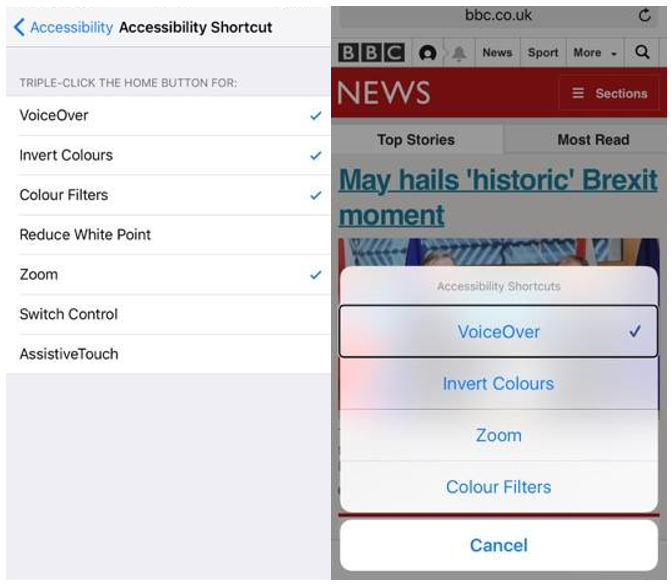
VoiceOver can also be toggled on and off quickly and easily without going into settings. To do this, add VoiceOver to the accessibility shortcuts list (Settings > General > Accessibility > Accessibility Shortcut: select VoiceOver). You can then toggle it on by triple tapping the home button and selecting VoiceOver.
Navigating with VoiceOver
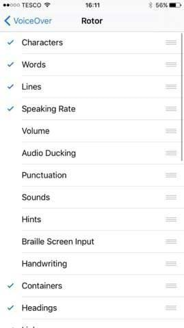
Navigate to next and previous elements on a page by swiping left and right. You can also use the ‘Rotor’ (by using 2 fingers and turning them round) to skip to certain types of element on a page (headings or buttons, for example). Once you have chosen the type of element, swipe up and down to cycle through them. Then swipe right to hear the content.
Navigating by element is an important technique, so it’s important to test the page this way. For example, many screen reader users skip from heading to heading until they find something useful, and then swipe right to hear the content underneath the heading.

The options that appear in the Rotor can be changed by going to: Settings > General > Accessibility > VoiceOver > Rotor
Android
Switching on the screen reader
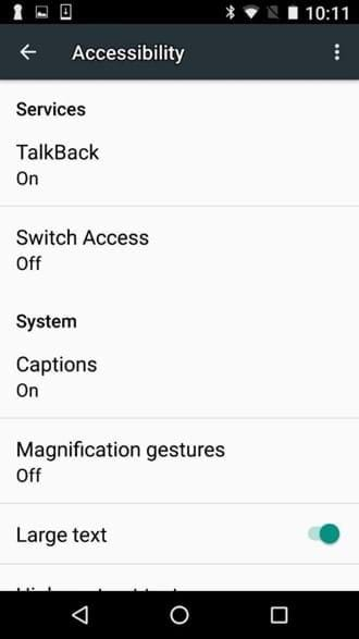
The built in screen reader in Android is called TalkBack. You switch it on by going to: Settings > Accessibility > TalkBack > On.
Unlike iOS, some Android devices do not provide the option to toggle TalkBack on and off. Nexus devices do, however, which makes them ideal for testing. To toggle Talkback on a Nexus device, press the volume up and down buttons at the same time.
Toggling Talkback is especially useful when testing pages further through a user journey. For example, if you need to test a ‘Payment’ page at the end of a booking process, you can save time by navigating to the page without TalkBack and then toggling it on. This also lets you test pages that you might not be able to reach with a screen reader (because accessibility blockers earlier in the journey get in the way!).
Navigating with TalkBack
As with iOS, the simplest gesture is to swipe left and right to the next and previous elements. There are two menus you can access called the ‘Global context menu’ and the ‘Local context menu’.
The ‘Global context menu’ provides options such as reading the page, reading from a current position, repeating the last utterance etc. You can access this menu by swiping down, then right, dragging your finger over the menu to hear menu items and double tapping.
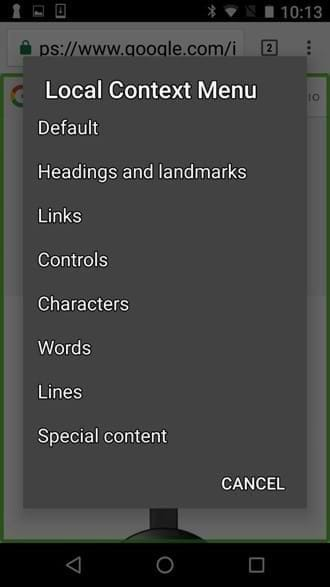
The ‘Local context menu’ is more similar to the Rotor settings in iOS: it allows you to navigate by a certain element such as headings or links. This menu can be accessed by swiping up, then right, dragging your finger over the menu items and double tapping.
This blog will continue with Testing accessibility on a mobile device - Part 3 - Manual accessibility testing.
