Testing Accessibility on a Mobile Device - Part 3: Manual accessibility testing
5 minute read
In this series, we’ve talked you through two different approaches that will find many of the accessibility issues on the sites and apps you review. Automated testing will help you to find issues such as:
- Missing form labels
- Insufficient colour contrast
- Heading level structures
- Missing document language
And using a screen reader has helped you to understand the experience of users with limited sight whilst finding issues such as:
- If interactive elements read out as “clickable” using the screen reader
- Logical focus order
- If headings coded as headings
- If buttons, iframes etc. are labelled
- If error messages are read out to screen reader users
That just leaves us with the frustrating last issues that neither of these approaches may not find for you. For these kinds of issues you simply have to read the page and look at the code. Issues you need to manually trawl for like this include:
- Descriptive error messages
- Use of colour to convey meaning
- Descriptive headings and link text
- Captions and transcripts for videos/audio clips
- Consistency throughout the pages
- Justified, italics or all caps text
- Ensuring the text size increases when large font sizes are set in the settings
- Reading age levels
- Ensuring zoom is enabled
The Web Content Accessibility Guidelines (WCAG) cover a range of accessibility issues to ensure each web page is accessible to one of three possible levels (A, AA, and AAA). Use these guidelines to ensure all areas of accessibility are covered.
As the WCAG guidelines can be quite difficult to read and understand, I use the WebAIM recommendations for each guideline. These recommendations are written clearly and have more focused suggestions.
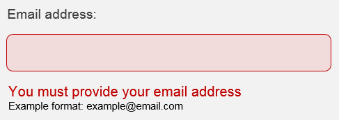
So let’s take descriptive error messages as an example, this will not be picked up during automated testing and may not be picked up by screen reader testing. When I test error messages, I act, basically, like a user acceptance tester: first I submit a blank form and look at the error messages. I then review the error messages to make sure they are user-friendly and descriptive, for example, “The value is invalid” is not descriptive and does not tell the user which form field it applies to. A better example is shown below:

This error message correctly indicates that the field is left blank, including a sample email address format.
I then check specific issues such as email address fields with a space or without an @ symbol. “Email address is invalid”, for example, is not an accessible error message: it does not tell the user why their entry is wrong or how to fix it. “Email address must contain an @ symbol. Example format: example@email.com” is better because it explains where the issue is and provides an example email address format to help users complete the form.

This error message correctly indicates the field where the error has occurred and explains the error, including a sample email address format.
Some form fields have no error messages and only highlight the fields in red. This causes two accessibility problems: the lack of descriptive error messages and the use of colour to convey meaning.

This form only indicates errors through a coloured highlight.
Colour should never be the sole method of conveying meaning for many reasons. Users with colour blindness may not see the red colour to identify the invalid fields, and screen reader users will have the form read out to them, which will not identify any changes in colour.
For these users, it can be virtually impossible to submit the form. Having checked error messages, I then continue with all of the errors I have not yet covered in a similar way, reading heading and link text, checking captions and so on. Having worked through a page with all three of the methods we have covered, I can be pretty sure the page is thoroughly checked and any issues are flagged for designers or developers to address!
In Summary
Automated testing, manual testing and screen reader testing are crucial to accessibility testing on mobile – each of them will find issues that the others will miss. Use them all and you will definitely improve the accessibility of your work.
One final suggestion: if you are able to do so, I strongly recommend usability testing with real users who have accessibility needs. The approaches above can’t replace the evidence and insights you will find from actual users really trying to use your sites or apps.
